After giving out our surveys asking people if they would like to participate we were able to get 40 participates. 15 women, 23 men and 2 non-binary people volunteered to be in our research. All the participates did not vary in age so we will not look at that as we thought there wasn’t variation in age to make an opinion on it. The range was from 16-20 which is a range of 4 so there wasn’t much to talk about.
The first thing we looked at was Stress vs Work Performance. We wanted to see how strong the relationship was, so we had to use a linear regression test. The linear regression test will determine whether there is an existing relationship however we must check the requirements for the test.
- Does the scatter plot look linear? So basically, we just must look at our plot and see if it resembles a straight line.
- Look at the two variables and see if their histograms look normal. A normal histogram sees if the data you collected is like it says, normal. So, does the data clump up in the middle and then evenly distribute throughout the range?
- Do we have at least 20 data points? This requirement ensures that we have enough points to make a line that is not biased. Because if we had like two points that would obviously create a perfect line.
- Is the residual plot random? Should the residual plots be patterned it would mean the data points are close to zero creating an almost perfect line. “Perfect” lines indicate that there is possibly some bias in your data.
And with that lets begin our requirements starting with the Stress vs Work Performance graph.

The scatter plot here doesn’t look like there’s much linearity in the data points but there is something. It’s not enough to call it linear but I’ll proceed with caution as if it was.

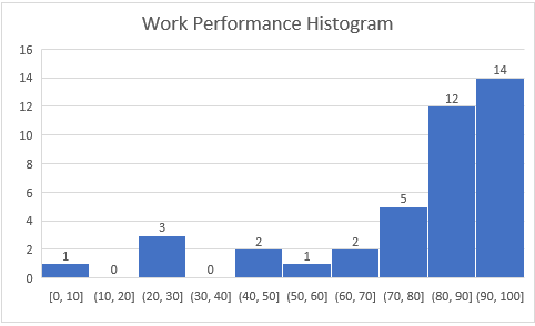
The Stress level histogram look normal. It makes a hill, with clumped up data in the middle and evenly distributed throughout. However, the Work Performance Histogram doesn’t look normal but, so we’ll take that into consideration and proceed with caution.
We have 40 data points, so we satisfy the 20 data points requirement.

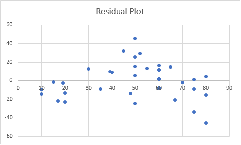
The residual plot is just graph of the data points The residual plot looks random enough although there is a slight pattern on the top. Again, we proceed with caution. Now to go into detail of the graph!
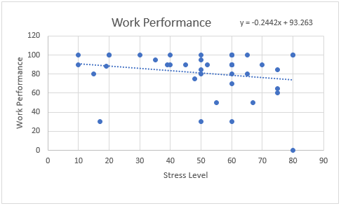
With these data points we produced a linear equation of
Work Performance = -0.244(Stress Level) + 93.263 and an R-value of -.2043.
R-values determine just how strong the relationship between two variables are. The closer you are to 1 the stronger the positive relationship is. The closer to -1 you are the strong the negative relationship is. And the closer to 0 you are determines a weak relationship. One thing to note is that the R-value does not determine how steep the slope of the line is but whether the slope is negative or positive.
Since our R-value is -.2043 the relationship between Stress Levels and Work Performance is not strong but, there is a relationship there.
Based on our linear equation if you have zero stress you would have a work performance of 93.263%. Also, if we were to increase how stress by 1 unit, our work performance would decrease by 0.244%.
We also then decided to look at Stress vs Workload

This scatter plot is very linear and is accepted for the linear requirement.
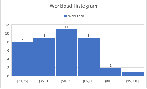
Both histograms are normal and fit the histogram requirement.
Again, we have 40 participates so we fit the 20 participates requirement.
This residual plot is random and fits the randomness requirement. We may now proceed with the linear regression test.
With these data points we produce a linear equation of
Work load = 0.3748(Stress level) + 35.85 with an R-value of .3807.
Since we have an R-value of .3807 we have a relatively strong positive relationship here. Based on our equation if you have zero stress then you’ll have 35.85 units of workload. And if you increase your stress by 1 unit then, your workload will increase by 0.3748 units.
After these two relationships the correlations between two variables got weaker and weaker so we won’t bother observing those. For example, the next strongest R-value we had was -0.029 so the relationships were practically non-existent.
Now we went to observe Men vs Women. We didn’t get enough Non-binary’s responses to draw any conclusion when comparing genders. For clarification they were included in every other calculation (like the ones above) but, not when comparing genders.

Mean = 58.13 N = 15
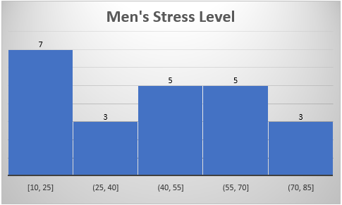
Mean = 43.91 N = 23
Based on the histograms it would seem that women tend to be more stressed than men.