POSTER BLURB
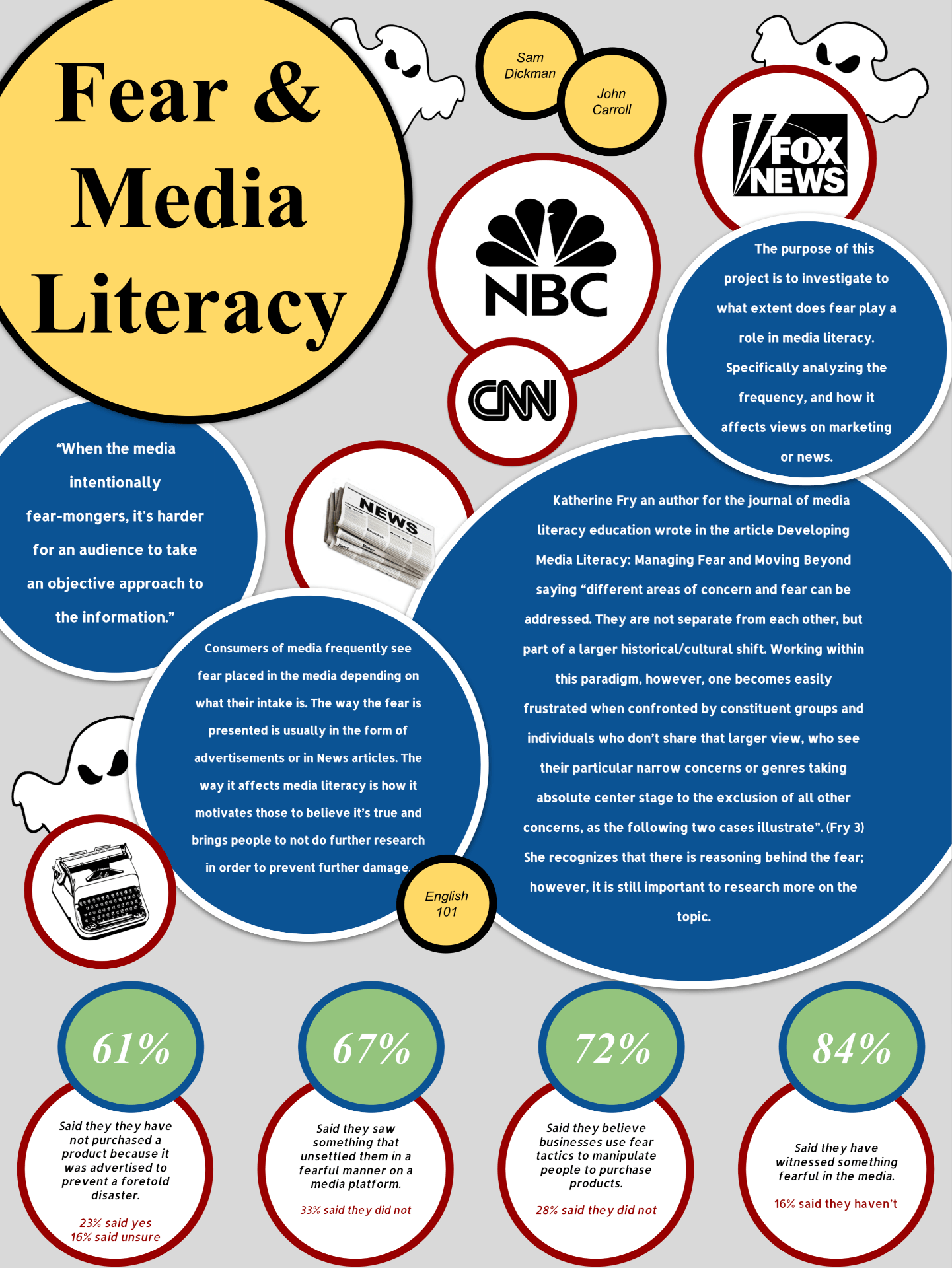
Our poster is just full of circles. Not sure exactly why but we figured people see way to many boxes on posters so it would be good to give the viewer something new. Our blue circles contain the main information of our poster. We decided to not use headers for these because we intended their dark color and size helps draw the reader to their importance. The bottom contains our data. We opted out of the traditional pie chart or graph because those kinda suck to look at especially if they’re tiny. The title is yellow so you can immediately see and know what our poster is about. The white circles contain images that are black silhouettes so that they don’t draw too much attention but also provide an aesthetic consistency throughout the poster. We also added ghosts because the whole fear theme and stuff.