

Artist Statement
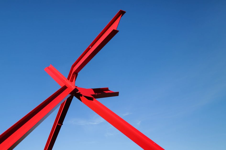
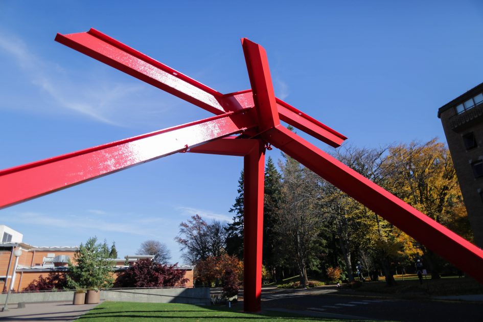
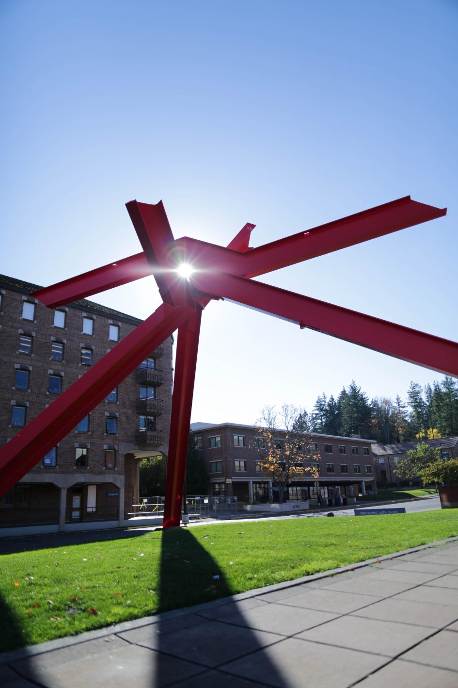
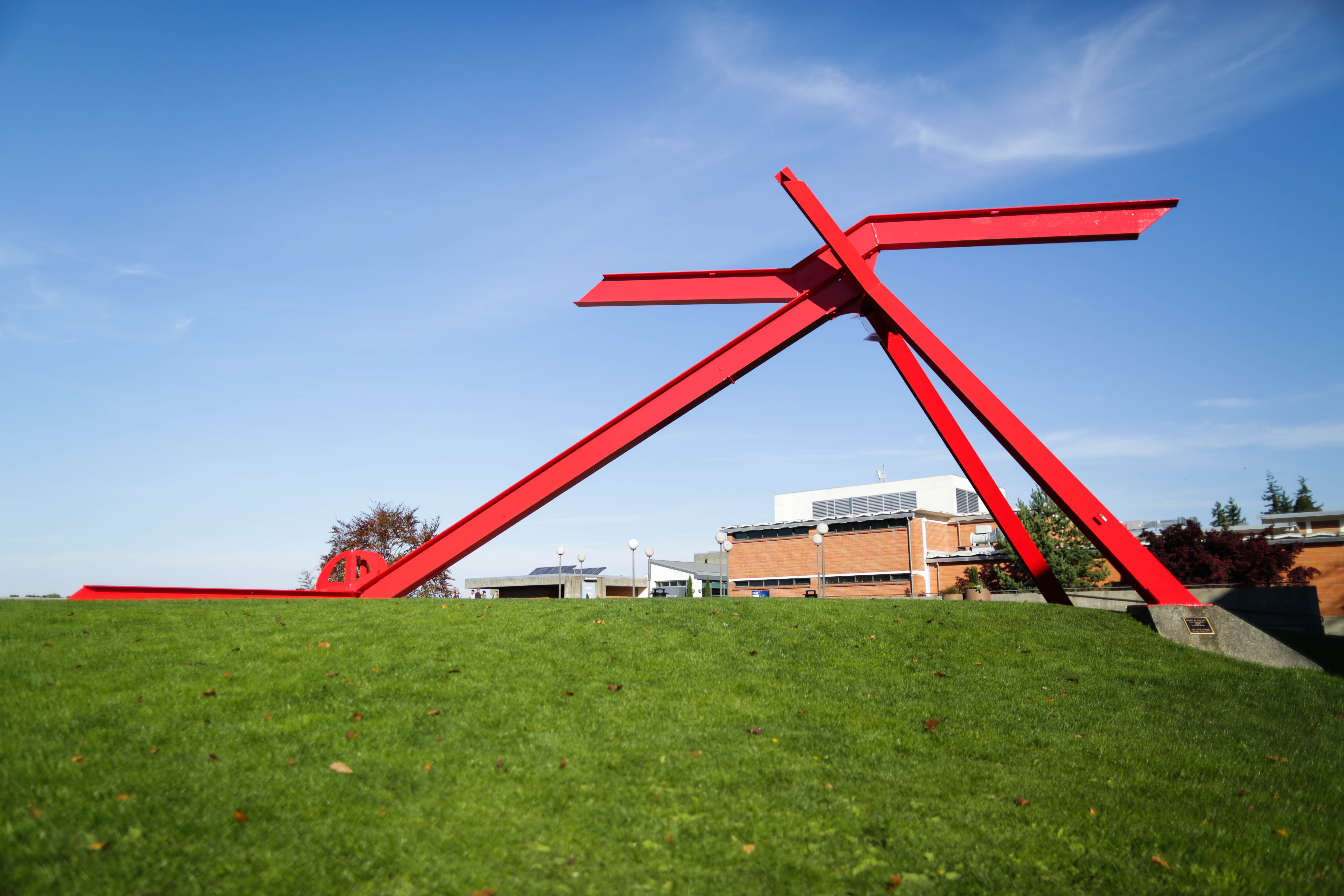
Standing 27 feet tall, “For Handel” is an excellent example of artist Mark di Suvero’s unique and abstract style. As the title indicates, the work was both inspired by and meant as a tribute to the classical music of the composer George Frideric Handel. Although the piece is characteristic of the same style as much of di Suvero’s other work with its strong, factory edges, its long sloping angles make it look almost like a musical note. Much like music, “For Handel” is meant to be an experience. Viewers can walk under, climb on, and interact with the piece in a way not all sculptures allow. Its almost playground like appearance and sturdy construction invite the viewer to explore every bit of it they can.
Survey
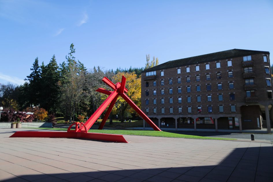
It is hard to imagine Western’s Performing Arts Center without the massive sculpture, but without a doubt, the space would be very different if it were not there. However, perhaps a more interesting question is how would the sculpture be changed if you were to move it somewhere else? What if you were to change the color? Di Suvero, like many other sculptors, build their work around its intended location. With this study, the goal was to determine how and in what ways color and setting affect the way a piece is interpreted. To test this, we presented fellow Western Washington students with three images; one of the piece in its natural setting, one where the sculpture is blue, and one of the piece in a new environment (a desert).
We asked 10 Western students these 5 questions:
1. How does this make you feel?
2. What do you think it is trying to say?
3. What emotions do you get from it?
4. Is there any symbolism/ parallels to things you might’ve experienced?
5. when you take the title into account, is your perception changed?
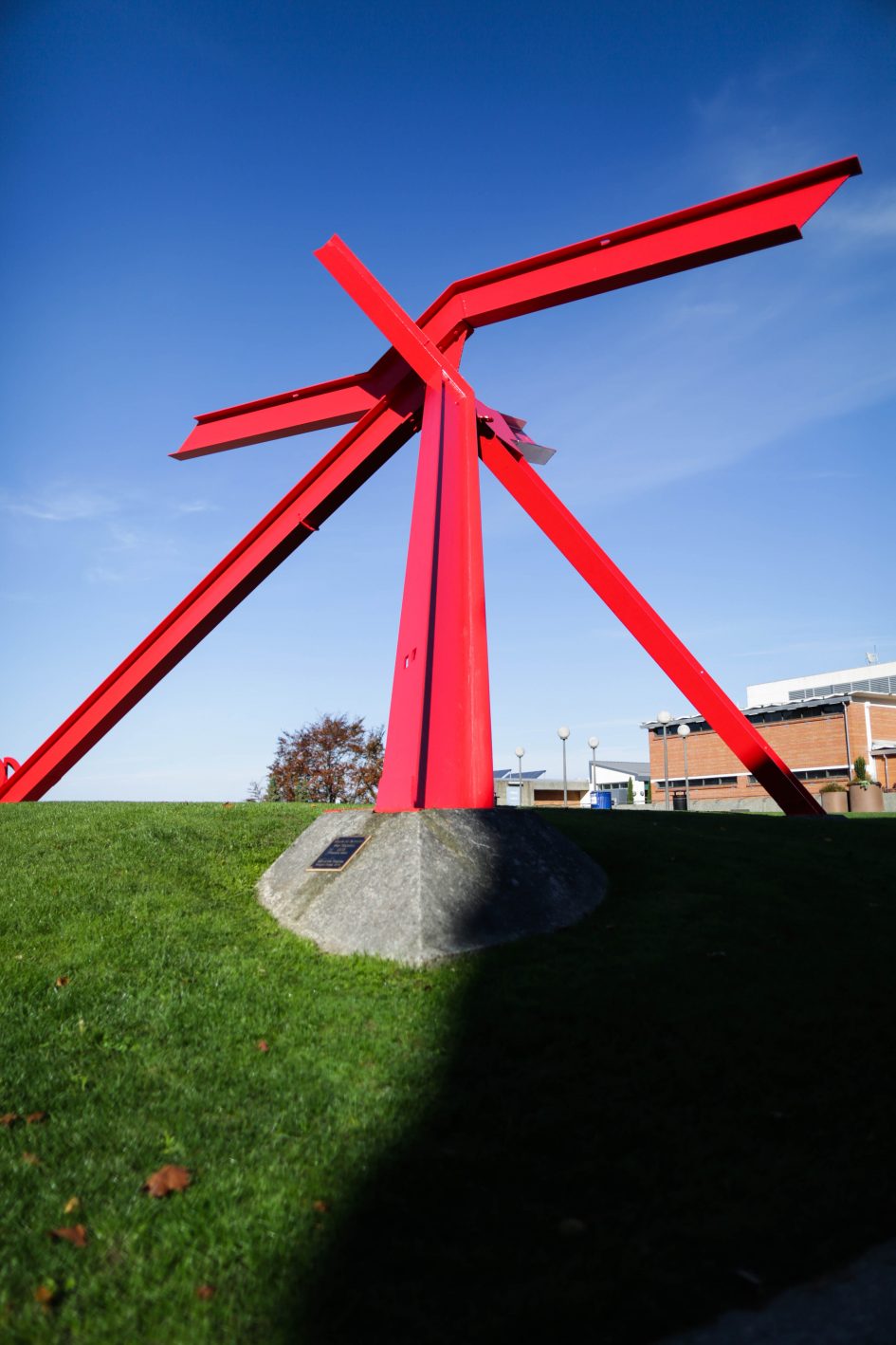
Our non-edited photo we showed 10 Western Washington students. Photo by Drew Boxold
For the original unaltered piece, interpretations varied, but trended towards a sense of playfulness, a need to climb, and the duality of the strength and fragility. When describing the latter statement, one participant said the sculpture embodies the sense of “strong parts with weak connections”, symbolizing the fragility of the industrial system. Things we think of as strong, steel I-beams, nuts, and bolts, are balanced out with a seemingly unstable structure. The parts lean on each other, and if one falls, the whole sculpture would crumble. The trend of playfulness was also very common throughout the interviews. More than half of those asked said they wished to climb on it because the red reminded them of a play structure. Interestingly, once viewers were told the piece was called “For Handel” after the music composer, there was a noticeable change in reaction. People started forming their opinions around the idea of music, drawing new parallels that they hadn’t seen before, such as the shapes of music notes, and an overall notion of movement.
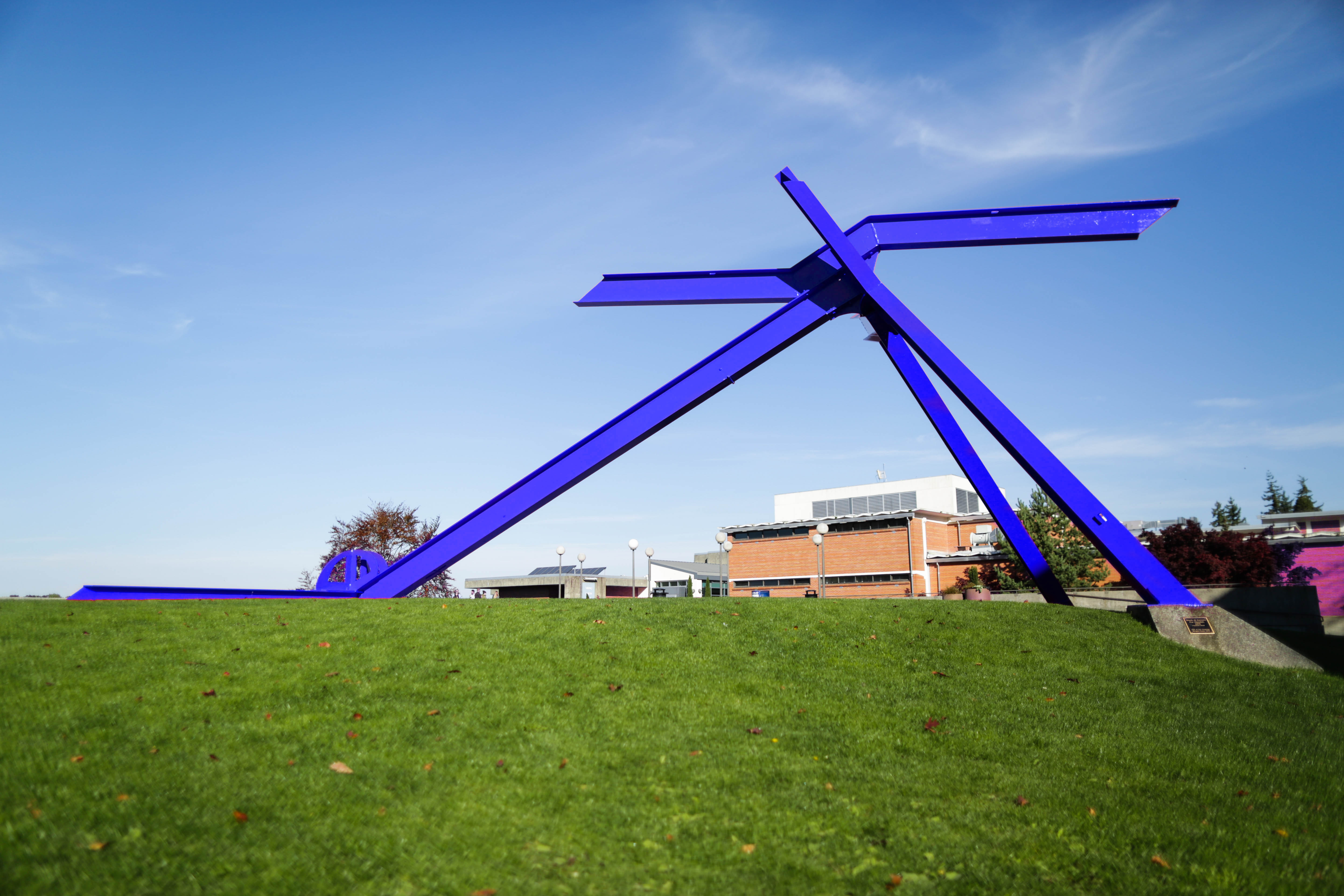
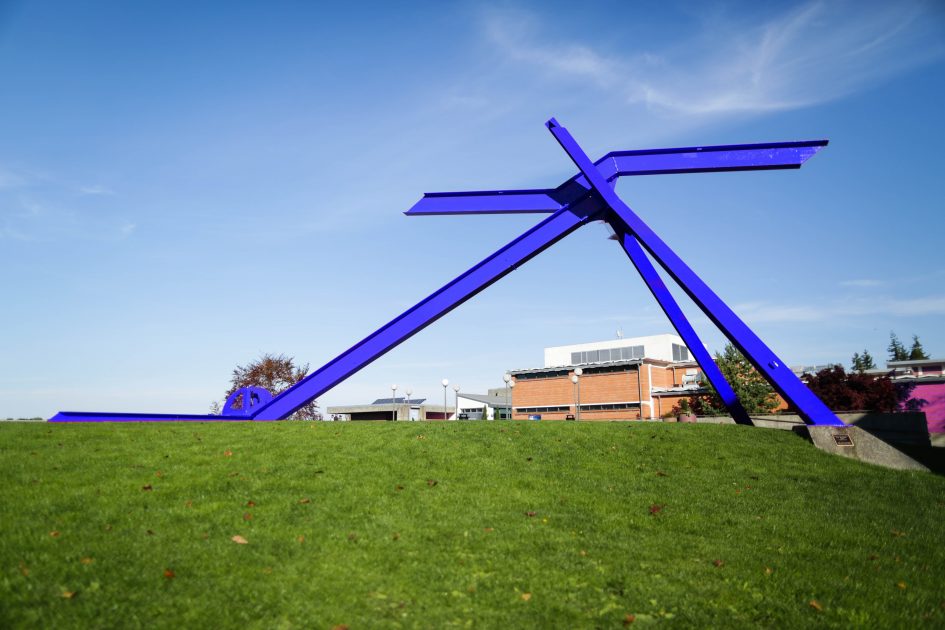
For Handel changed to a blue color. Photo by Drew Boxold
When we changed the color from red to blue, a majority of students said the blue was more subdued than its real life counterpart. As one person put it, “This one is less lively. It’s almost depressing.” Another attributed the more subdued feeling to a lack of contrast with the sky. Instead of evoking industry, it comes across as more human. Many said they identified more with the sculpture when it was blue than when it was red. The sense of strength and fragility was also very common, but in a different way. One participant said he could “identify with it (the blue sculpture) more. It’s both strong and weak like the other one, but to me, it symbolizes the human version of it; how if just one part were to fall away, the rest would follow.”

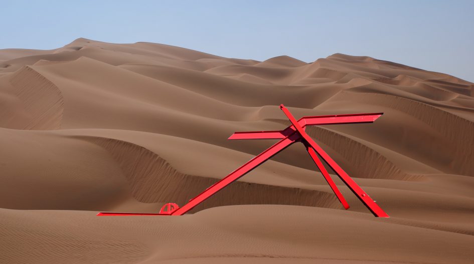
For Handel relocated to a Saharan Desert. Photo by Drew Boxold
With the desert piece, things got a little more interesting. One interviewee claimed it looked “more like a camel, whereas the normal sculpture reminds me of a giraffe.” On this image, those questioned did not parallel each other nearly as much. One viewer likened the third image to that of an oasis. Another said it reminded her of a lost civilization. And one person even said it “looks like a mystical dragon.” If anything the trend here was different views. People took longer to come up with their answers and often seemed less sure about them. One view we particularly liked said “the red is the fragility of the industrial system, the blue is the fragility of the human condition, and the desert is the fragility of nature. It’s just like a tree the wood is strong, but even in the deepest digging trees, the roots don’t go that deep. It’s still fragile. ”
Thoughts
So, how much do color and setting influence a piece? The short answer is a lot, but when you go deeper, you realize it’s not everything. While the setting and the color certainly add to the sculpture, it is its forms that make it truly what it is. Although the reactions to the three images were all very different, certain basic ideas were still common throughout. The theme of strength and fragility is in all of them, but when it comes down to specifics, that’s where the interpretations begin to deviate. For a majority of people the theme of strong parts but weak connection was something they agreed with. The setting and color just served to focus this idea and make it more specific. So what do you think? How did the changes affect the way you viewed “For Handel”? Did you find yourself thinking the same? Or were your views completely opposite? Let us know!
Words by Nick Sun and Drew Boxold
Cited Works
Leave a Reply