Reading Response

Theory 3: Copying, Capturing, & Reproducing (pg 171-215)

Photography involves different stages of reproduction- starting with capturing the original subject, then production of a negative, to printing the positive image. Photographic images possess the presence of the original subject, Susan Sontag goes on then to explain that a photograph is not just an image (like a painting is an image), an interpretation of the real; it is also a trace, something real like a footprint. Photographs present us with traces of the past…I love this concept. They also can provide a kind of portal into the past, but Trachtenberg warns that when a viewer becomes consumed (transported to the time and place of the photo) he/she might unconsciously assume the perspective of the photographer and his/her cultural, economic, and political biases. I think this is interesting, there is this danger (that the viewer might assume knowledge due to inclusionary nature of a photograph) but I think this kind of transportation can also be extremely powerful (like images of war can make the violence and grief of those thousands of miles away a reality to viewers sitting at home).

Krappy Kamera

I’ve been looking at a lot of Holga photography lately. I was researching Michelle Bates for my presentation and came across the Krappy Kamera competition by Soho Photo. There is a lot of interesting things going on in the toy camera world.

This like goes to the latest Krappy Kamera winner: http://sohophoto.com/2012_KK_WebGallery/index.html

You can find archived Krappy Kamera winner galleries at http://sohophoto.com/krappy_kamera_comp.html

Back in High School…

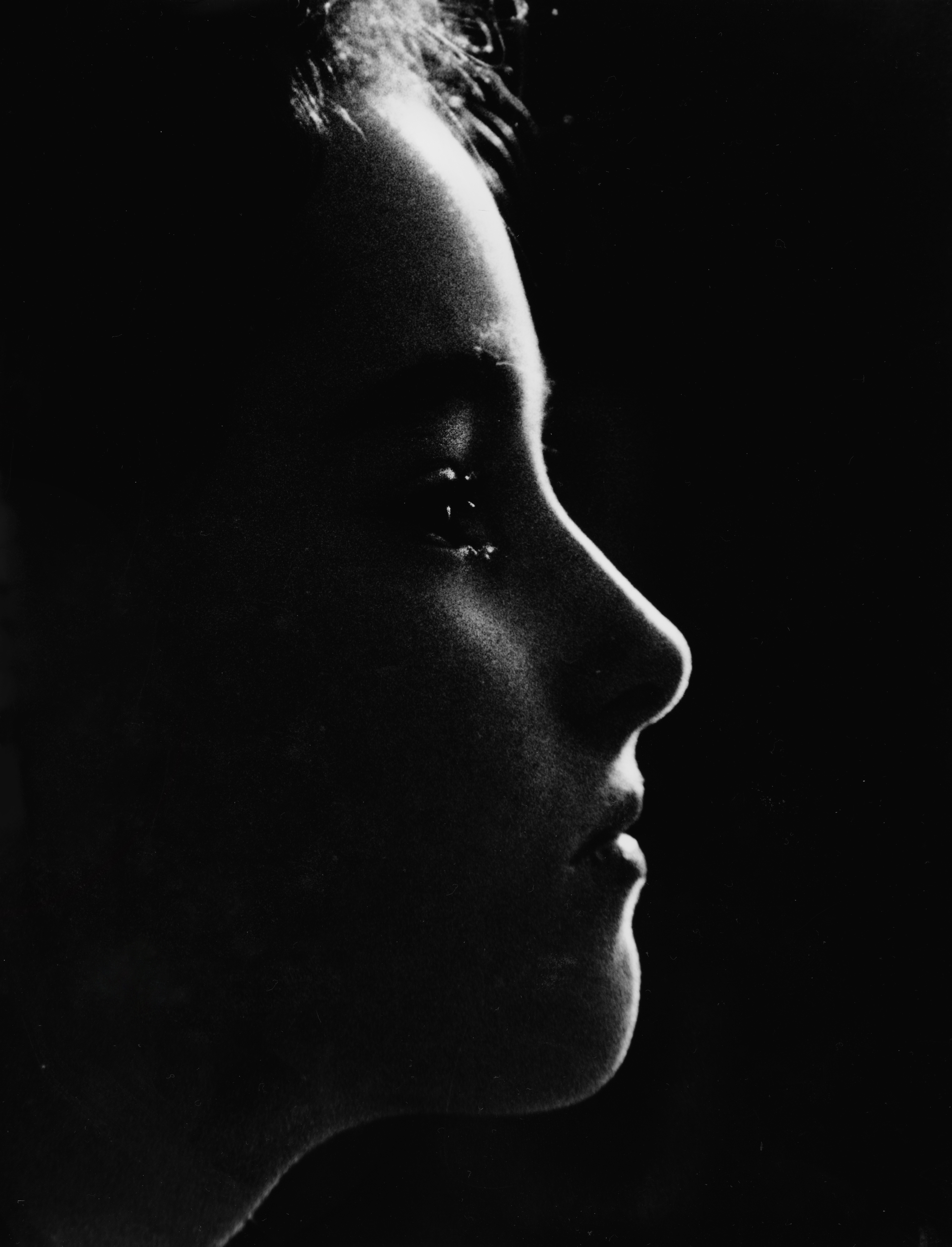
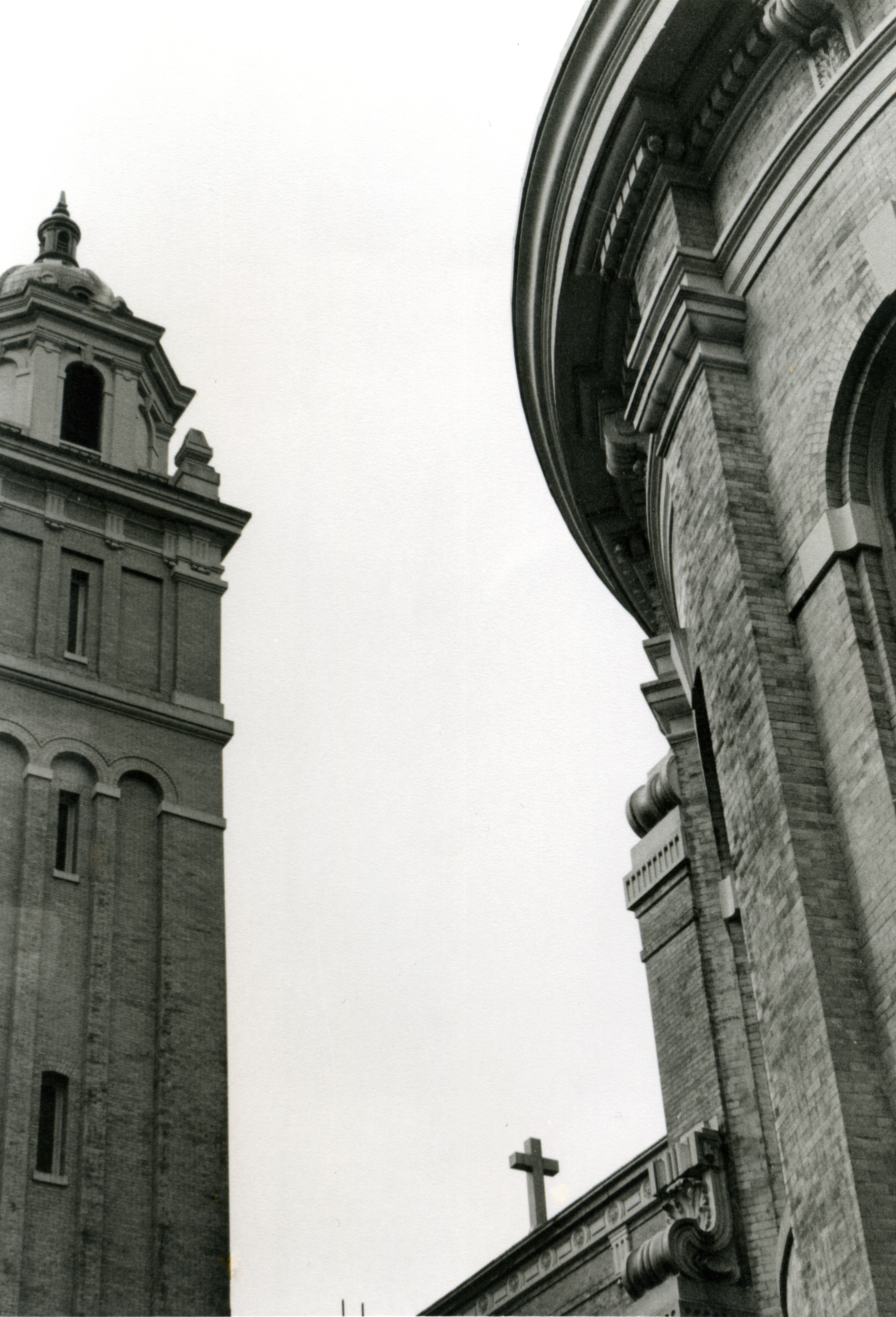
I recently found some old print I had scanned back in High School. It’s pretty interesting/weird to look back through old work.

This is a photo of my little sister. It’s actually a tiny section of the original print. I ended up playing around in the darkroom, using cropping, enlarging and moving the negative holder around to get the desired image. Later I scanned it and touched it up  a little in photoshop.

 This was taken at St. James Cathedral in Seattle in between Capital Hill and Downtown.

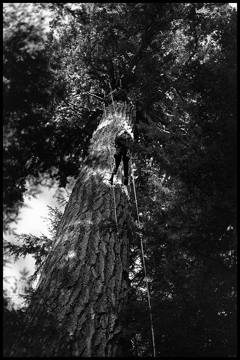
Old Growth Forest, Mt Baker Hwy

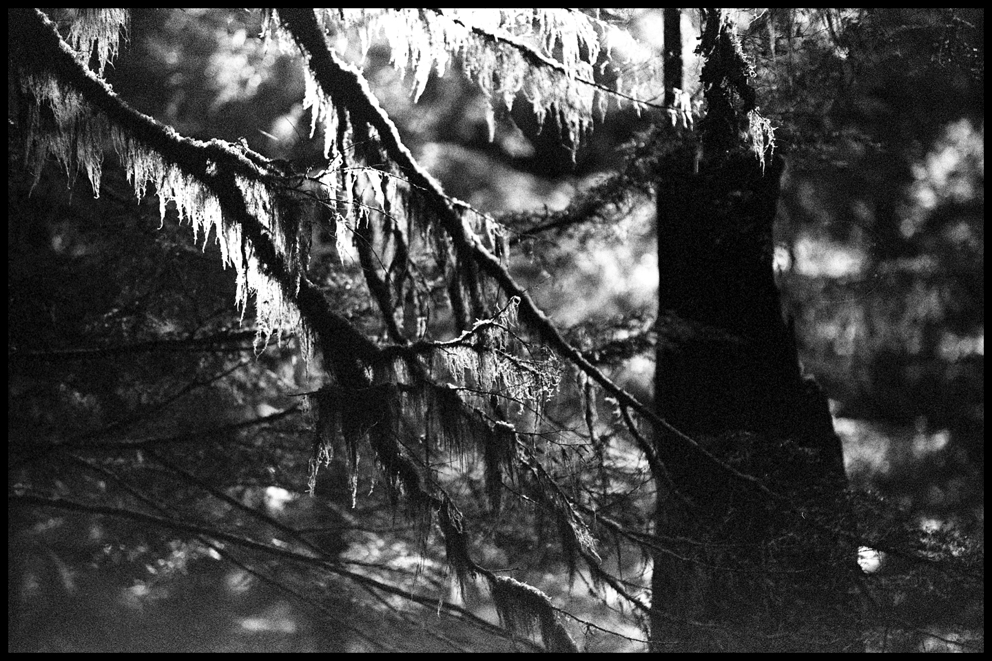
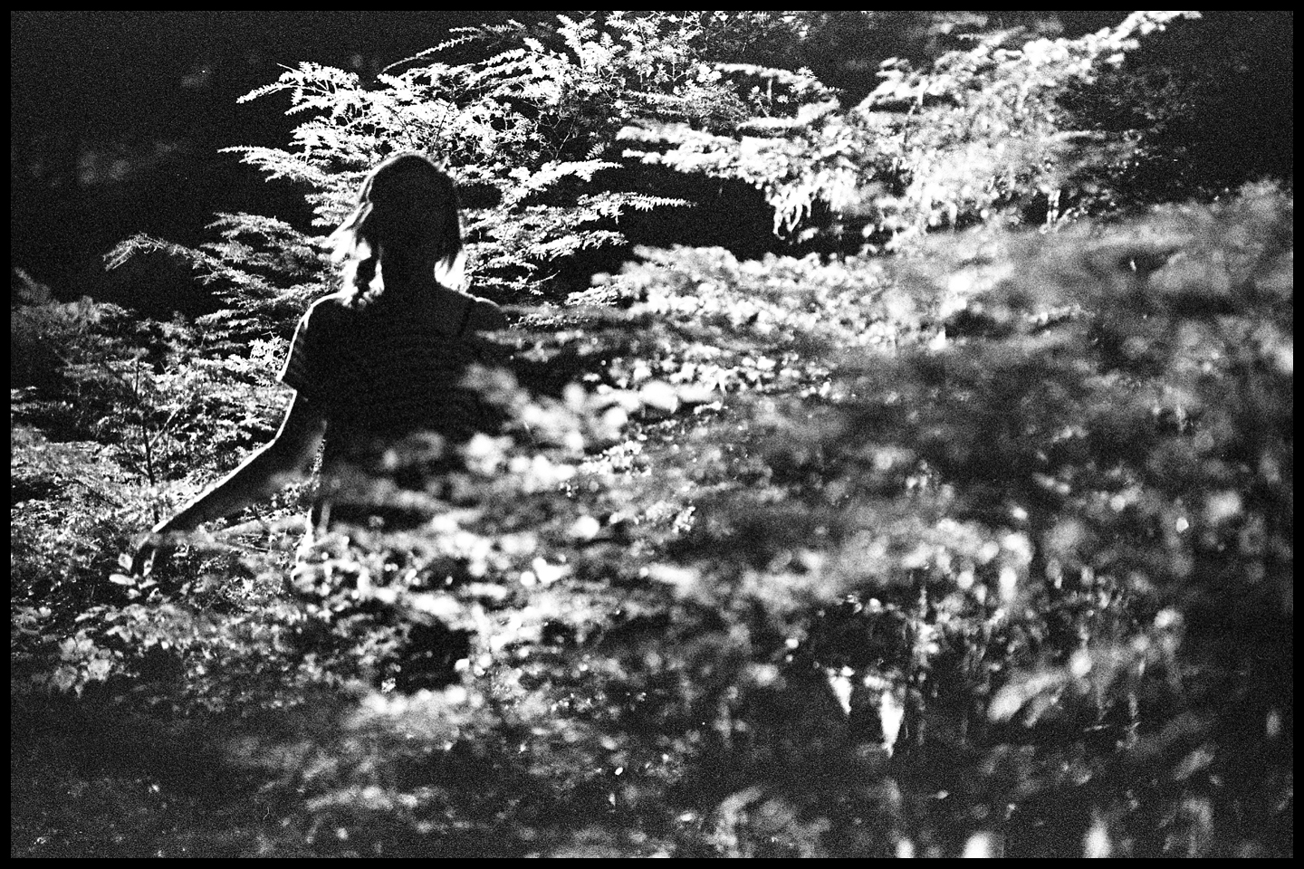
Yep, more scans. Trees this time. Shot these sometime in October and successfully ignored them until yesterday, when I discovered them under my bed. From the old growth preserve that borders hwy. 542. Kodak Tri-X 400.


It’s a little hard to get an idea of scale in this last one, but this is one of the larger douglas firs that you can reach from the highway, over 200 ft tall.

Thomas Czarnecki: From Enchantment to Down

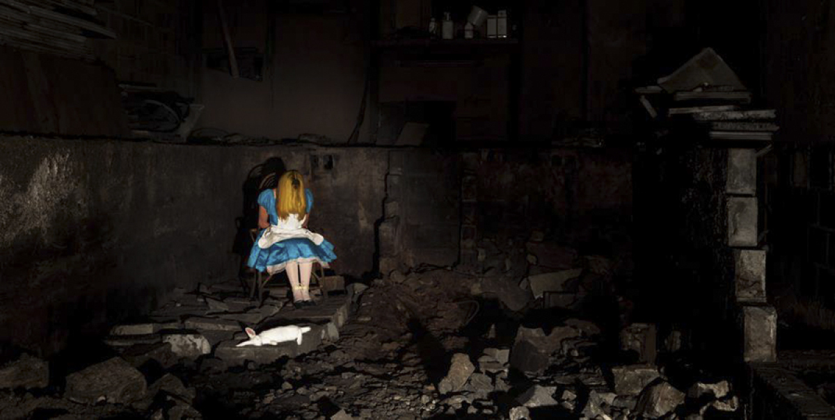
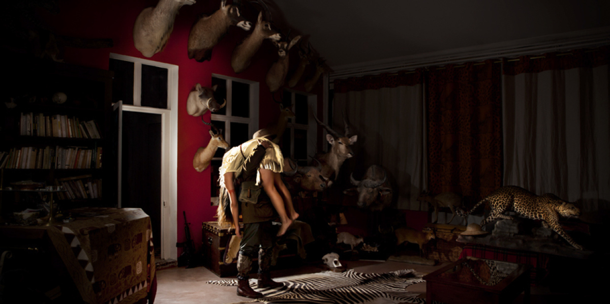
Found something interesting today- Thomas Czarnecki’s series of grim Disney Fairy Tale-inspired photos.

Here’s the link:THOMAS CZARNECKI Photography

In my opinion, the bright colors distract from the dark tone. But I can see how others would find this all the more disturbing, as the colorful dresses are a reminder that the characters come from children’s movies.


I think I like this one the most. The way Alice is sitting hanging her head reminds me of the scene from the animated movie where she sits down and bawls her eyes out.

This one, however, is just ridiculous:

It’s supposed to be Pocahontas, in case you couldn’t tell.

Nan Goldin

http://www.moma.org/collection/artist.php?artist_id=7532

Nan Goldin is a different kind of photographer who takes powerful photos. Her work seems to give the viewer a peek into the intimate lives of her subjects (mostly her friends and family), exhibiting themes like love, gender, domesticity, and sexuality almost always shot with available light (natural lighting). The lighting adds to the intimate feeling behind her photos, also giving them a cohesive feel.

Her work is very intriguing to me. Perhaps because her images seem to elude to a somewhat dark background story.

Anna Huix— Pure Class

Aside from this being a pretty sweet collection from a person with a great understanding of light, this site of the photography of Anna Huix is a really great example of efficiency in an online identity.

Throughout the site you’ll find some professionally commissioned projects with a good balance of other personal projects. Extremely clean presentation all around..

Image

http://www.annahuix.com/commissions/