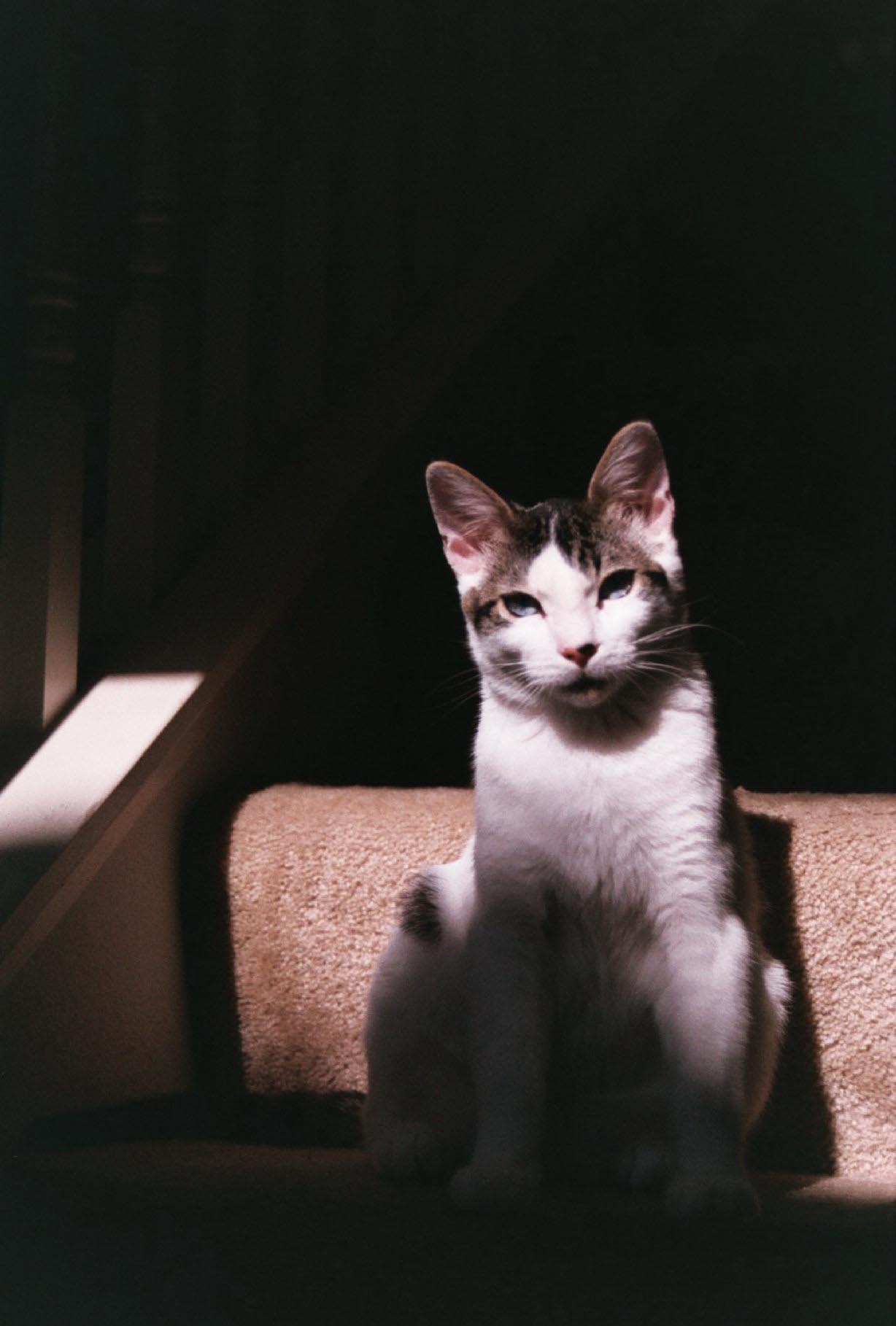
Bokeh

Book Heart by Eric Martin

I’m sure many of you have seen an image that use Bokeh. I honestly had no idea what it was called till now though. Bokeh is a term from the Japanese word “boke” which means to blur. In photography, we use the word Bokeh for parts of an image that may not be in focus.

The Bokeh can be easily created in many different shapes using just a sheet of black paperboard. You can find a tutorial on how to do so here.

Bokeh has a lovely graphical feel to the photo, creating a surreal, dreamlike feel to the image. It can also have a highly textual feel.

Bokeh by Mohammed Bin Ghulaitah

REsponse to the HolgA

The Holga 120 film and light plastic frame work made it hard for me to take seriously at first, but I did like the quirkiness  portability and freedom I enjoyed using it as supposed to my cautious use of My DSLR  it kind of reminds me of analogue instagram. I do feel like the pictures i took with this camera were more playful than the 35mm film:)

Reading response To light and shadow

I found this chapter portion of the reading particularly helpful though the explanations  of front and back lighting, Bracketing(shooting the same still t different exposures). how shooting at different times of the day affects light color. (which is linked to white balance) how high ISO’s are linked to noisy grainy images, reflecting and diffusing light…and how different variables such as texture shape color and angle will affect how the light bounces or softens. also how flashes can contribute to a cleaner light and sharp focus objects. this contributes to me having a fuller understanding of photshop and lightroom software. painting with light and shadows is a powerful tool for creating unique images …I hate to sound cliche’ but that is what i got out of the chapter.

Imogen Cunningham

I was looking through the photograph archive on Imogen Cunningham’s website and was blown away by every picture. Some of her work dates back to 1910 or 1920s (the first one below!) and still looks extremely modern. Some of her other photographs have a story telling/myth feel similar to Julia Margaret Cameron. Please check out http://www.imogencunningham.com because her work is very inspirational.

Steven Meisel

Steven Meisel and Eyeball worked together to blend fashion, photography and graphic design in to an innovative 30-page spread for Vogue Italia’s most prominent issue of the year. This also required designing the front cover of the magazine itself.

Each spread became its own digital collage, designed to showcase the models in a moody, urban environment, with splashes of bright color standing out against the dark backdrops. Steven Meisel photographed his models on a green screen backdrop with as few physical props as possible. EyeballNYC composited these images on top of their digitally created backgrounds, which were pieced together from still photographs of New York City. The end result was a surrealistic juxtaposition of high fashion against a dark film noir cityscape.” (source)

I would consider this a controversial set of images, considering the subject and the media (digital collage and green screen!). The narrative is interesting.