I am really fond of the tonal range and contrasts in Moriyamas black and white photos.. I also like the urban tone that is often found in his images.
Category Archives: Inspiration
Imogen Cunningham
I was looking through the photograph archive on Imogen Cunningham’s website and was blown away by every picture. Some of her work dates back to 1910 or 1920s (the first one below!) and still looks extremely modern. Some of her other photographs have a story telling/myth feel similar to Julia Margaret Cameron. Please check out http://www.imogencunningham.com because her work is very inspirational.
Phil Poynter
Steven Meisel
“Steven Meisel and Eyeball worked together to blend fashion, photography and graphic design in to an innovative 30-page spread for Vogue Italia’s most prominent issue of the year. This also required designing the front cover of the magazine itself.
Each spread became its own digital collage, designed to showcase the models in a moody, urban environment, with splashes of bright color standing out against the dark backdrops. Steven Meisel photographed his models on a green screen backdrop with as few physical props as possible. EyeballNYC composited these images on top of their digitally created backgrounds, which were pieced together from still photographs of New York City. The end result was a surrealistic juxtaposition of high fashion against a dark film noir cityscape.” (source)
I would consider this a controversial set of images, considering the subject and the media (digital collage and green screen!). The narrative is interesting.
Flower Photograms
““Through The Green Fuse” is series of photos by Robert Buelteman, actually they are photograms. His technique is quite complex and dangerous, it’s based on Kirlian photography. He places flowers and leaves on a color transparency film, on top of that he lays plexiglas with a sheet of metal in between, floating in a liquid silicone. Then he hits everything with an electric pulse which causes the coronas and outlines to appear on the film. The last step he needs to do, is hand-painting it with a white light coming from an optical fiber. It can take up to 150 attempts to get this right. You can read more about it at Wired.”
3-D Sculptural Photographs
“The Polish photographers Szymon Roginski and Kasia Korzeniecka worked together to create these images for the “O Mia O” Spring Summer 2009 collection of Ania Kuczynska. First they photographed the collection which they then cut up and transformed into 3d objects. The result was photographed again and used for the “O Mia O” collection.” (source)
With my admiration for modular origami, I thought this series was really awesome. It adds a whole new level of “depth” to the scene. Reminded me of Hockney as well.
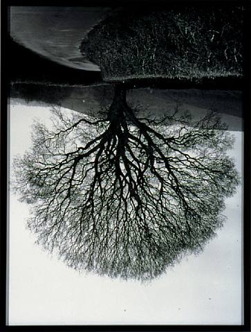
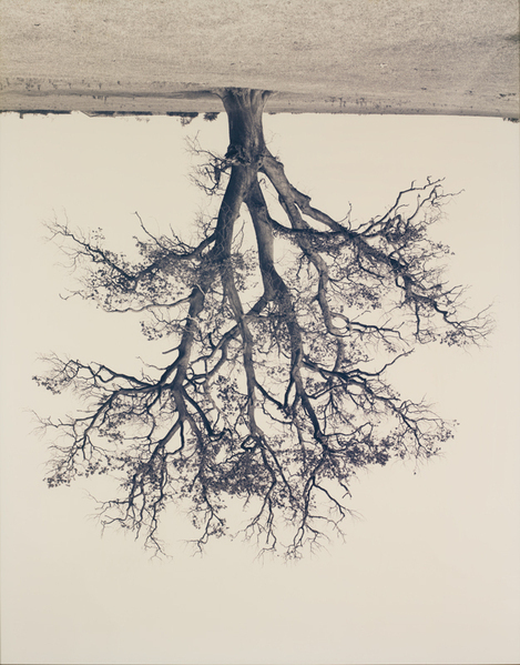
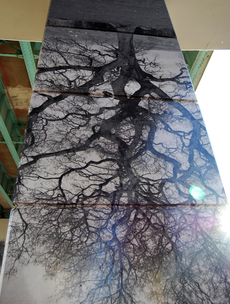
Rodney Graham
Ansen Seale
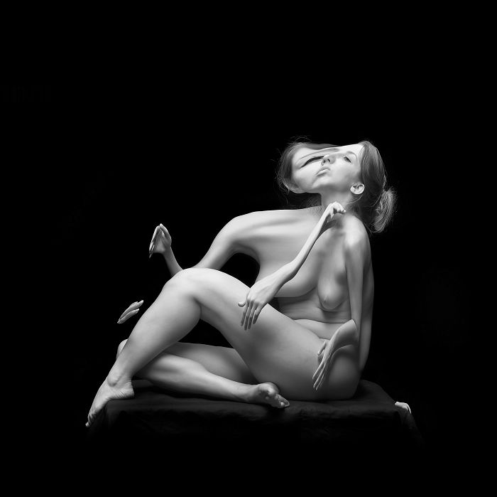
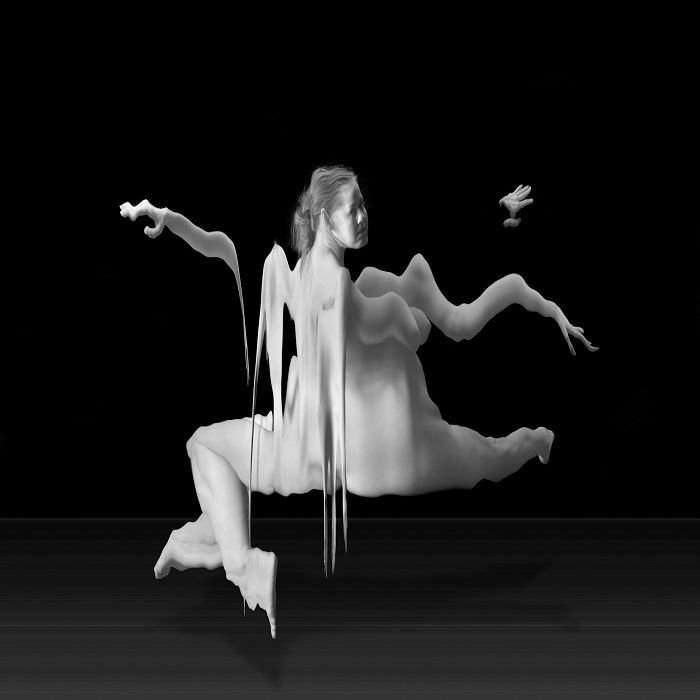
These are really awesome “slit-scan” photos by Ansen Seale (click for more from the series “Temporal Forms”). The shots are made in camera and even the wikipedia article makes it sounds really complex. Maybe something to try in the future when I have plenty of time on my hands. Anyway, this technique eerily distorts the image:
Hedi Slimane
I thought these editorials by Hedi Slimane, a French photographer and designer, had a really intriguing environment. They’re also in B&W and seem like they could serve as inspiration for future Body Shot projects. Interesting menswear fashion photography.
http://www.hedislimane.com/fashiondiary/index.php?id=7 for more from this set and Hedi’s photo “Diary”
Cool Black and White City Shot


