Steven Meisel

Steven Meisel and Eyeball worked together to blend fashion, photography and graphic design in to an innovative 30-page spread for Vogue Italia’s most prominent issue of the year. This also required designing the front cover of the magazine itself.

Each spread became its own digital collage, designed to showcase the models in a moody, urban environment, with splashes of bright color standing out against the dark backdrops. Steven Meisel photographed his models on a green screen backdrop with as few physical props as possible. EyeballNYC composited these images on top of their digitally created backgrounds, which were pieced together from still photographs of New York City. The end result was a surrealistic juxtaposition of high fashion against a dark film noir cityscape.” (source)

I would consider this a controversial set of images, considering the subject and the media (digital collage and green screen!). The narrative is interesting.

Instagram

I thought I’d see what all the hype was about with the Instagram app. Voila, my first Instagram photo! =D

It’s basically an app that has you take your photograph, insert a filter, then post to facebook, twitter, etc. Instant shiney beautiful filtered photo :3

If nothing, the app lets you post the image quite a bit easier then through the iphone camera and would be quite nice as a one a day project. And your iphone is likely to be on your person when you happen to go for a nice walk through town.

I retook the photo, showing another of the filter effects (they also add these border things) and the original file. If you try it and are attached to your original unedited images, make sure not to add the filter before saving the file. You can always choose an image and add a filter to it afterwards.

Instruments

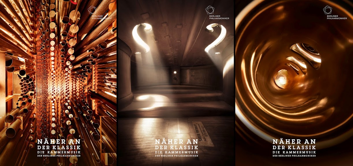
Bjoern Eweres directed these beautiful photographs of inside musical instruments for an advertising campaign for the Berlin Philharmonic Orchestra. I love how soft the lighting is within the images, and how each one looks like a large room rather then a cramped space that could be held in human arms. Also, after seeing Miyazaki’s new film Arrietty, all I can see is a small person climbing, dancing, or sitting within these spaces.

Storvandre

Alessandro Calzolaro (known as Storvandre on Flicker) is a Service Delivery Manager.

His photography seems to encompass everything, landscapes, architecture, flowers, clouds, murals, statues, and more. However, the images that caught my eye were his photographs of old historic buildings and statues (which I have streamed on my iphone through flipbook’s “Art History Images” =D).

If you’ve noticed, I like a lot of artwork that can serve as an inspiration or reference for other art. Calzolaro’s artwork looks like it can serve not only as a beautiful photograph, but as documentation.

Moon Games

http://www.pixheaven.net/galerie_us.php?id=22

Moon Games is a lovely set of photographs by Laurent Lavender. The idea is a simple one, the photographer plays with the figure and the moon, much the photographs tourists take of themselves tipping over or holding up the leaning tower.

Each set of photographs tell a tale. A man plants the moon, or children at play pass the moon much like a volley ball to each other. In many of the photos the figure is a silhouette (and if you were in my body shots group you’d know that I’m a sucker for silhoettes). I feel that the set titled Moon Games (where the figure is cutting the moon with scissors or catching it with a net) worked the best out of the series as the dark contrast of the figure and ground against the blue sky and moon was the most visually striking.

response to Reframing Photography pages49-105

Hmm I don’t know really what to respond to this portion of reading except that it helped me understand viewfinders shutter speeds and focal planes a little more. It was nice to have F-stops and apertures and their relationship to depth of field further explained as well. the comparisons of DSLR’s and “point and shoots was laid out and easy to understand. i also appreciated the quick overview scanners printers and Photoshop controls. basically this portion of reading explained the basic of image making in its various forms to me.

Marcus J. Ranum

I mentioned Marcus Ranum in one of my previous posts and decided to elaborate on the artist.

Marcus J. Ranum is a computer and network security researcher credited with innovations in firewalls and intrusion detection systems. He has a large stock photography account on DeviantART that he keeps as a hobby. Basically his gallery is full of the body shot project, his subjects ranging from classical nude photography much like what you would see in a figure drawing class, motion studies, to just about any prop that you can think of.

He makes his work extremely accessible to artists to use in photo manipulations and are great as reference photos for artists learning anatomy.

http://mjranum-stock.deviantart.com/

Ranum sets his entire gallery as mature in protest to DeviantART’s censorship, stating that “a regime of self censorship is a greater attack on artistic creativity than totalitarian control would be; it forces the artist to victimize themself.”

If anyone is interested in going back into the light room and doing more body shots, I highly suggest that they take a look at Ranum’s tutorials. He also has a lighting guide for photographers seeking to create their own light room on a budget and shows that low budget lights can still create beautiful photos.

http://mjranum-stock.deviantart.com/journal/#/d1yls3u

http://mjranum-stock.deviantart.com/journal/#/d1yo7vk

3-D Sculptural Photographs

“The Polish photographers Szymon Roginski and Kasia Korzeniecka worked together to create these images for the “O Mia O” Spring Summer 2009 collection of Ania Kuczynska. First they photographed the collection which they then cut up and transformed into 3d objects. The result was photographed again and used for the “O Mia O” collection.” (source)

With my admiration for modular origami, I thought this series was really awesome. It adds a whole new level of “depth” to the scene. Reminded me of Hockney as well.